How can I improve the user experience with the search button? I’d like to see if it’s possible to add a search magnifying glass icon to the main header, next to the heart (wishlist), or perhaps add a search bar below the main header or since you have more experiencie than us, what do you recommend for the mobile version?
I see you have a compact search box, in most cases that works perfectly fine as it is always at hand and the user can initiate it anytime.
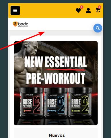
In you case you have a very nice header space, you could also use a full width search bar just between the header and the content. I would probably go with that instead of a compact search.
You have a guide to make the full width search bar for mobile in Astra theme? Because i try myself to do it like the desktop version and ite btoke the mobile version bar, look ugly the bar and the search results
I’m not very familiar with themes in general unfortuantely, there is so many of them, but I am more than happy to suggest.
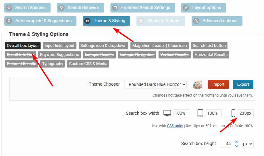
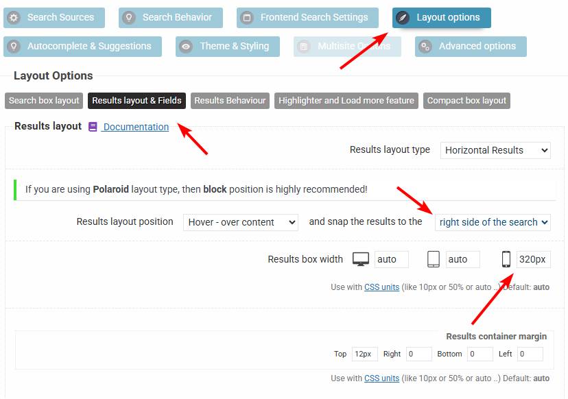
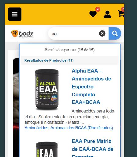
I think you may have it in the right position, it may only need a bit of adjustment. If you turn off the compact layout, then I would change the search bar width to a fixed 230px, and the results width to 320px for mobile and snapping to the right side, and that should give you a layout very similar to this.
.