The market is filled with multimedia/mobile devices. We are constantly using our mobiles/tablets/pc’s not caring about our vision. Our eyes however need to rest, but on these devices we experience mostly low contrast, hight brightness with bad colouring and poor typography, which hurts our vision.
About a year ago a software called f.lux started to trend amongst designers, which is actually a great tool to prevent you from the “flashy” pictures when you are trying to get some sleep. If you are not doing color sensitive work, I highly recommend this software.
However I strongly believe, that there is a better way – by using the right colors when designing the user interface.
Do you remember the time, when most websites used to have high contrast/colorblind versions? We should implement “night mode” option as we are using our devices in the dark as well. This should be the renaissance of the high contrast options. Some apps/websites are already using this nice feature.
How to choose the right colors
Keep in mind the following three “night mode” rules:
- Dark/mate background
- Light, but not too bright content/text
- Different complementary colors for highlighting important parts
Example
Take a look at reddit’s alien blue iPhone application – night mode on the left and regular on the right
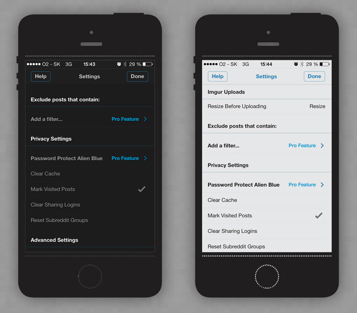
Magnificently looking. I would say it’s a bit too dark for a background, but very nicely done. You can see the dark background, light, but not glowing content text and the blue links – exactly following the three “night mode” rules.
Creating a pattern
In my humble opinion, the real life is the place to look for a relaxing color pattern. We do like to look at the dark sky with the shining stars, the universe, the sunset or sunrise, dark stormy clouds on a beach, the sea.
The main (background) color should be a from the cold side of the color scale: blueish, greenish or violetish – this is the most important color of the pattern as it covers more than 90% of the UI.
How I create such palettes
- I pick a dark relaxing picture
- Upload it to pictaculous
- Profit:
Too easy huh? Actually picking the right picture can take some time, but yes, that’s it.
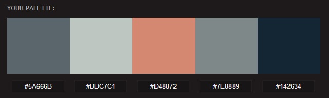
Using the palette
As you can see the blue is the darkest color so that will be the background, the light grey one is going to be the content color and the light orange is going to be the link color.
Result

How about that? That wasn’t hard. Pretty neat for a first try.
Remember the three “night rules” when creating a night mode UI.