Multiple Problem
Home › Forums › Product Support Forums › Ajax Search Pro for WordPress Support › Multiple Problem
- This topic has 9 replies, 2 voices, and was last updated 8 years, 2 months ago by
Ernest Marcinko.
-
AuthorPosts
-
May 21, 2018 at 7:23 am #17940
jh52847
ParticipantHi so I am having some problems using Ajax Search Pro
Topic A. Ajax Search Pro Widget Width Responsive for main page and sidebar
page url: https://www.hanjstar.com
I want to use same widget in different area which are main page and sidebar on post pageI like current width for sidebar but I want this to be long for my main page
it solves the problem if I use just shortcode but I am using WPML duplicate page and updating this frequently so that every time I update my page, other page automatically displays this update. (So I have to stick to this wdget)
So my point is I want this search widget to be responsive on both sidebar,main page or even anywhere.
I tried to change:
1. Compact layout final width to 200px but it didn’t work
2. Theme option -> Search box width to 500% but it didn’t workTopic B: Search Result Count
page url: https://www.hanjstar.com
When I was using shortcode -> if I typed something like 원피스 on my Main Page it displayed more than 2 post per page,
but after changing it to widget , it displays only 2 post per page.
Is there anyway I can change this count to 4 or 8 ?
and if possible I want to display only 2 while keeping 4 for desktopThanks!
May 21, 2018 at 10:12 am #17945KeymasterHi!
A. You have a custom CSS that forces 20% width on the search box parent widget element: https://i.imgur.com/KDgtKlb.png
I suggest either removing that, or using a custom CSS to change the min-width attribute of the search:
[html]#ajaxsearchprowidget-5 {
min-width: 100% !important;
}[/html]Please note, that this is not directly related to the plugin, it is only a suggestion.
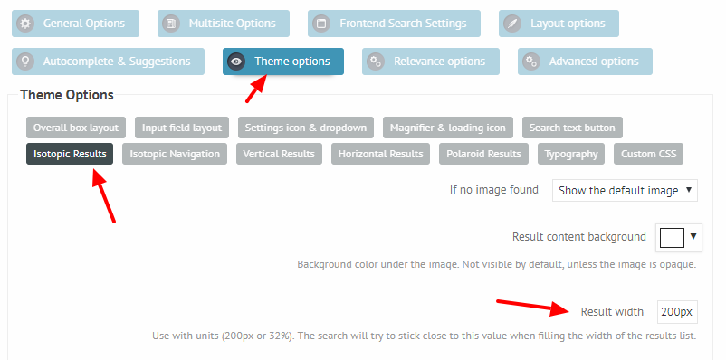
B. The column calculation depends on the seach final width, and on the initial width, that is defined on the back-end here: https://i.imgur.com/GFS80Dg.png
Lower value = more columns, higher value = less columns.
Once you fixed the width of the search bar, it will automatically adjust to the screen size, based on the defined results width.
May 21, 2018 at 2:56 pm #17960ParticipantThanks for reply
your solution works perfectly fine on desktop
but I got another problem.
and my search width is different for desktop and mobile.
Is there any way I can decrease mobile version ?
it’s long even if I delete css.also I tried to make some border on http://www.hanjsar.com/ja
it worked on desktop right away but not on mobile.
Seems like it makes delay.
I turned off caching in your plugin by default.
by the time you see my website it can have border but I expect this problem in the future.
Is there any way I can solve this problem?May 22, 2018 at 12:41 pm #17971KeymasterHi,
Usually media queries within custom CSS are used to identify mobile screen sizes. You can define rules for these screen widths. For example, if the max screen width is 480px, then this rule will apply. It should be placed after the previous rule in the custom CSS section.
[html]@media (max-width: 480px) {
#ajaxsearchprowidget-5 {
min-width: 50% !important;
}
}[/html]You can change the screen size, and define multiple rules like this as well.
The delay can be the browser cache, the plugin does not cache any of the files. Make sure to reload the browser by hitting CTRL + SHIFT + R buttons, it usually works.
May 22, 2018 at 6:03 pm #17982ParticipantHi I applied but it’s not working can you suggest other solution?
May 23, 2018 at 12:29 pm #17986KeymasterHi,
First, make sure that the search width is not set to 500%, that is not recommended at all. I recommend using the default 100% instead.
Then try these more generic rules instead. It will work with any search widget there.
[html].AjaxSearchProWidget {
min-width: 100% !important;
}@media (max-width: 480px) {
.AjaxSearchProWidget {
min-width: 50% !important;
}
}[/html]Depending on your needs, you will have to adjust the min-width numbers.
May 24, 2018 at 4:38 am #17992ParticipantThanks ! it worked on mobile as well. My width was 100%
but lastly, I want to change sidebar width as well.
If you see on this website.
https://www.hanjstar.com/drivers-high-by-larc-en-ciel/
sidebar search bar looks fine.
but as soon as I scroll down.
It become long.May 24, 2018 at 12:14 pm #18005KeymasterHi,
You are welcome!
It looks like the sidebar becomes a fixed position, where the percentage width may not work. Try somethign like this:
[html].asp_m_3 {
width: inherit !important;
}[/html]This way the search bar width should be the same as the container.
May 25, 2018 at 5:30 am #18014ParticipantThanks it works but I just want to make sure this is final solution.
because I still see something getting longer for a moment then comes back.
This is perfectly fine with me but I just want to make sure that If you can suggest further so that it actually doesn’t change its shape.
Link
if not this is fine with me thanks!May 25, 2018 at 11:57 am #18023KeymasterHi,
Well, it looks like it happens, when it starts scrolling, the container width is higher initially, so the search ball follows that width, that causes the effect. I’m not sure if it is possible to eleminate it, but it could be possible to make it a bit less visible:
[html].asp_m_3 {
width: inherit !important;
max-width: 330px !important;
}[/html] -
AuthorPosts
- You must be logged in to reply to this topic.